Welcome to the Getting Started Guide for the Additive Manufacturing Module
About this Guide and the Example Calculation
The Additive Manufacturing (AM) Module (also referred to as the AM Module) is an Add-on Module to Thermo-Calc and is available in Graphical Mode as the AM Calculator. The module has 3 simulation modes: Steady-State, Transient, and Transient with heat-source from Steady-State. This guide will walk you through how to set up a simulation using the Steady-state and the Transient with heat source from steady-state simulation modes. Steady-State solves the stationary problem for the melt pool given the Process Parameters. Transient and Transient with heat-source from Steady-State solves the time dependent problem for a single or multi-layer process for given Process Parameters.
The Transient simulation mode is not covered in this guide since the set-up is identical to Transient with heat source from steady-state. Transient calculations are of interest if you want a more accurate prediction of the start and end of each track in the scanning process. In general, Transient calculations are more time consuming than using the heat source from steady-state.
In this guide we will walk you through the set-up of a standard workflow in the AM Module by walking you step-by-step through setting up three common calculations – a steady state simulation and transient with heat source from steady-state simulation using both single track and multi-layers.
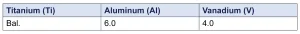
This guide will use the Ti64 alloy but the steps shown in this guide can be applied to other materials as well.
Composition of the Ti64 alloy [wt%]
The example simulation demonstrated in this guide is based on the example AM_04_Scheil_TransientSS included in your installation. To learn how to run example files, see the Thermo-Calc Getting Started Guide.
For this example:
Define System
The first step of the set-up is to select which database to use and define the material for the simulation. This is done in the System Definer.
For this example:
For this example:
For this example:
Apply Data Smoothing
Before you run the AM Calculator, it is important that the data you will base the AM calculation on does not have any sharp peaks or curves to be able to solve the numerical problem. To avoid this, you can apply Smoothing to your data. The default setting is Little Smoothing but this can be changed depending on your simulation.
To determine how much smoothing to apply, you can plot the different properties. In the Plot drop-down list you can select which property you want to plot to check the data and if there are any sharp peaks or curves in the plot. The plot appears immediately when you select a property. It is recommended to try running the simulations with only applying Little Smoothing. If the calculation fails, you can increase the smoothing and try again.
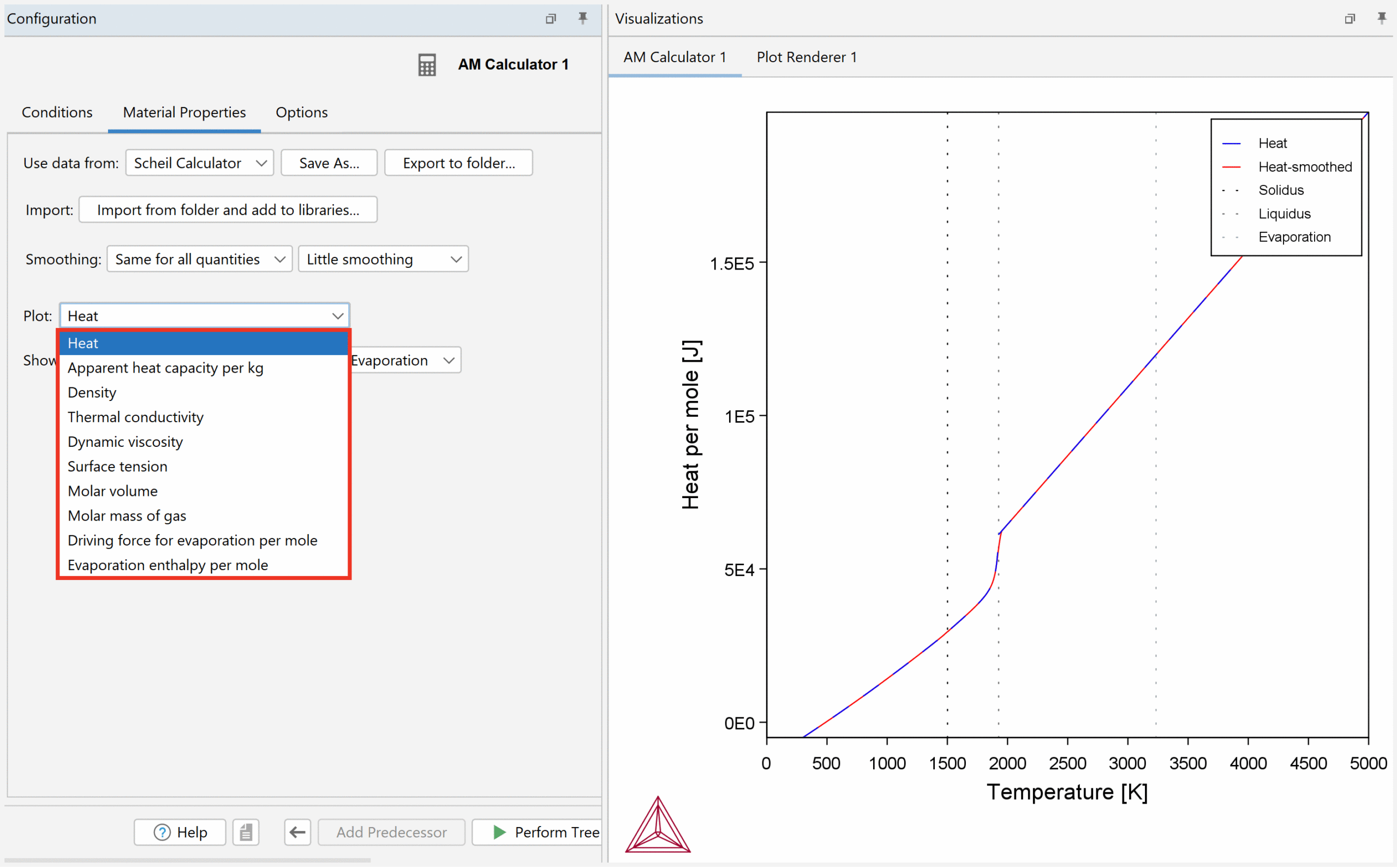
For this example:
Set Up a Steady-State Simulation
As a first step, we want to set up a simple steady-state simulation before performing simulations with increasing complexity.
Steady-state simulations are useful to get an estimation of the temperature distribution and size of the melt pool.
In the AM Calculator, click the Conditions tab. Here you can select which simulation mode to use and simulation conditions.
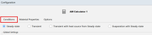
There are four different simulation modes available: Steady-state, Transient, Transient with Heat Source from Steady-state, and Evaporation with Steady-state.
About the Simulation Modes
For this example:
Result of the Steady-state Simulation
Once the simulation is complete, click on the Plot Renderer node. Keep the default settings and click Perform at the bottom center of the program. This will populate the simulation result as a 3D plot in the Visualizations window.
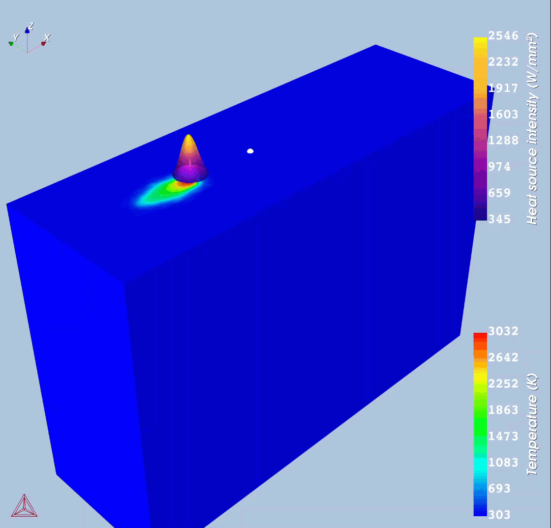
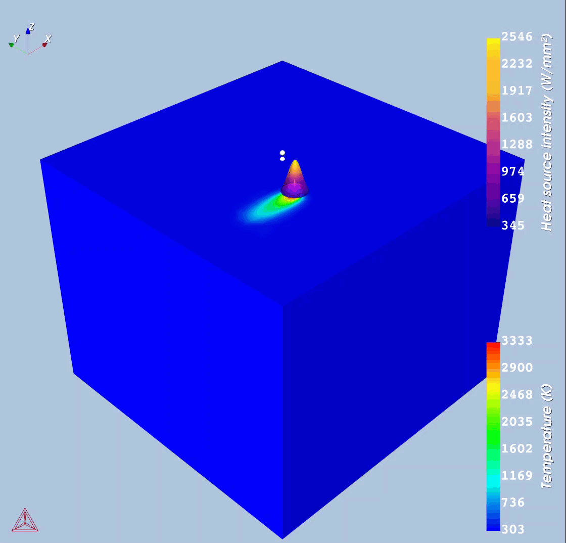
3D Plot
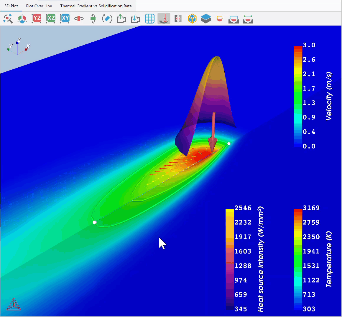
The 3D plot shows how the temperature varies in the build part in the form of a color map. Click the ![]() button to zoom to the heat source position.
button to zoom to the heat source position.
The heat source is represented by the canonical shape around the arrow and is a heat map of the surface intensity. For the Gaussian heat source mode, which we are using, the shape remains the same regardless of the configuration of the heat source. However, for the Core-ring mode, the surface changes shape depending on the Heat Source settings you set in the AM Calculator, such as power, radius, and absorptivity.
The arrows in the plot demonstrate the fluid flow in the liquid. As can be seen, the glyphs (arrows) are too large to distinguish. Therefore, change the Glyph scale factor to 0.3 to get a better view (done in the Configuration window of the Plot Renderer).
The contour lines (green, round lines) show the solidus and liquidus lines. Hence, the mushy zone is the area between the two contour lines.
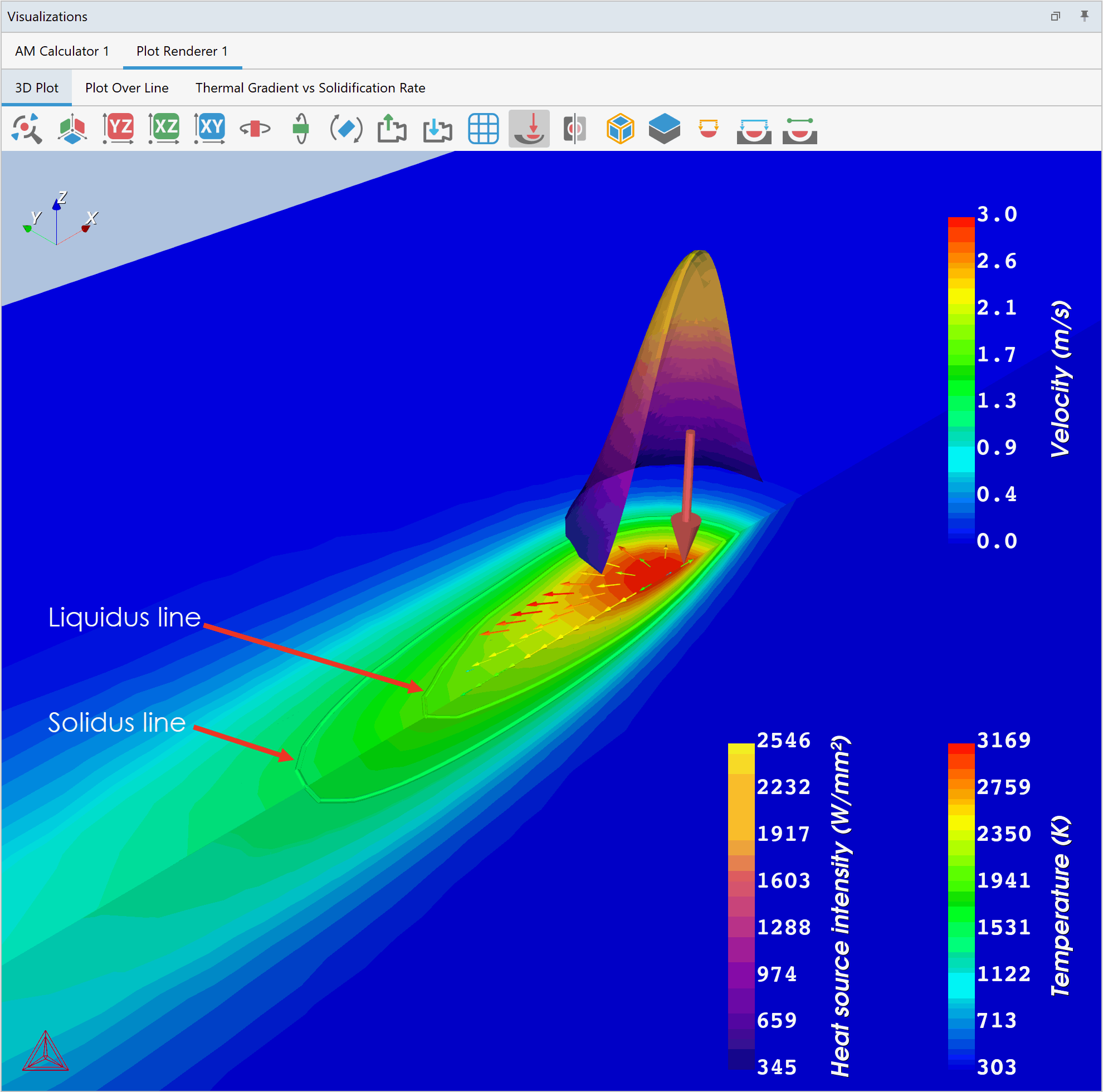
This plot makes it easy to measure the size of the melt pool. To measure the melt pool, click the Show size of melt pool button ![]() from the top panel. The melt pool measurements will appear in the plot.
from the top panel. The melt pool measurements will appear in the plot.
You can also measure the size of the melt pool + mushy zone by clicking the Show size of melt pool + mushy zone button ![]() . Again, the measurements will appear in the plot. The results are also shown in the Event Log where you can copy the information to store it elsewhere.
. Again, the measurements will appear in the plot. The results are also shown in the Event Log where you can copy the information to store it elsewhere.
The result only shows half of the build part, but you can easily show the entire part by clicking the Mirror geometry button ![]() .
.
Plot Over Line
In the Plot Renderer, you have a second tab named Plot Over Line. This plot demonstrates how the properties vary along a line. To add this plot, click on the Plot Over Line tab and check the box next to the plus and minus signs.
By default, the variation of temperature is shown in the plot. You can change which property to plot by clicking the Quantity drop-down list. The dashed lines show the transition temperatures.
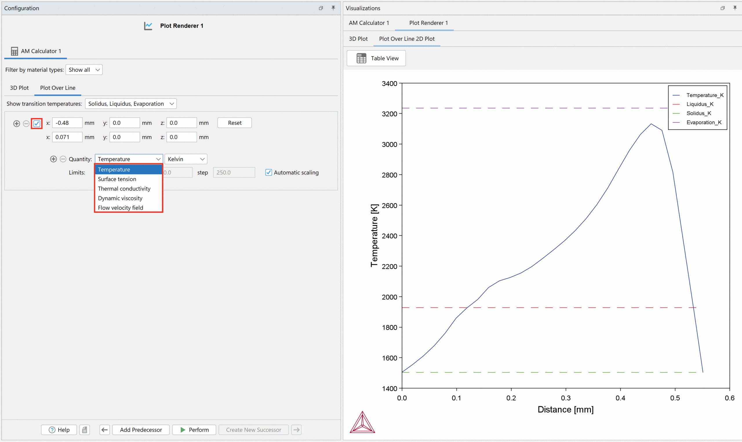
In the 3D plot, you can move the line to look at the properties at other positions, as shown in the GIF below. You can also change the coordinates in the Configuration window to move the line. The Plot Over Line plot is automatically updated with the result at the new line position.
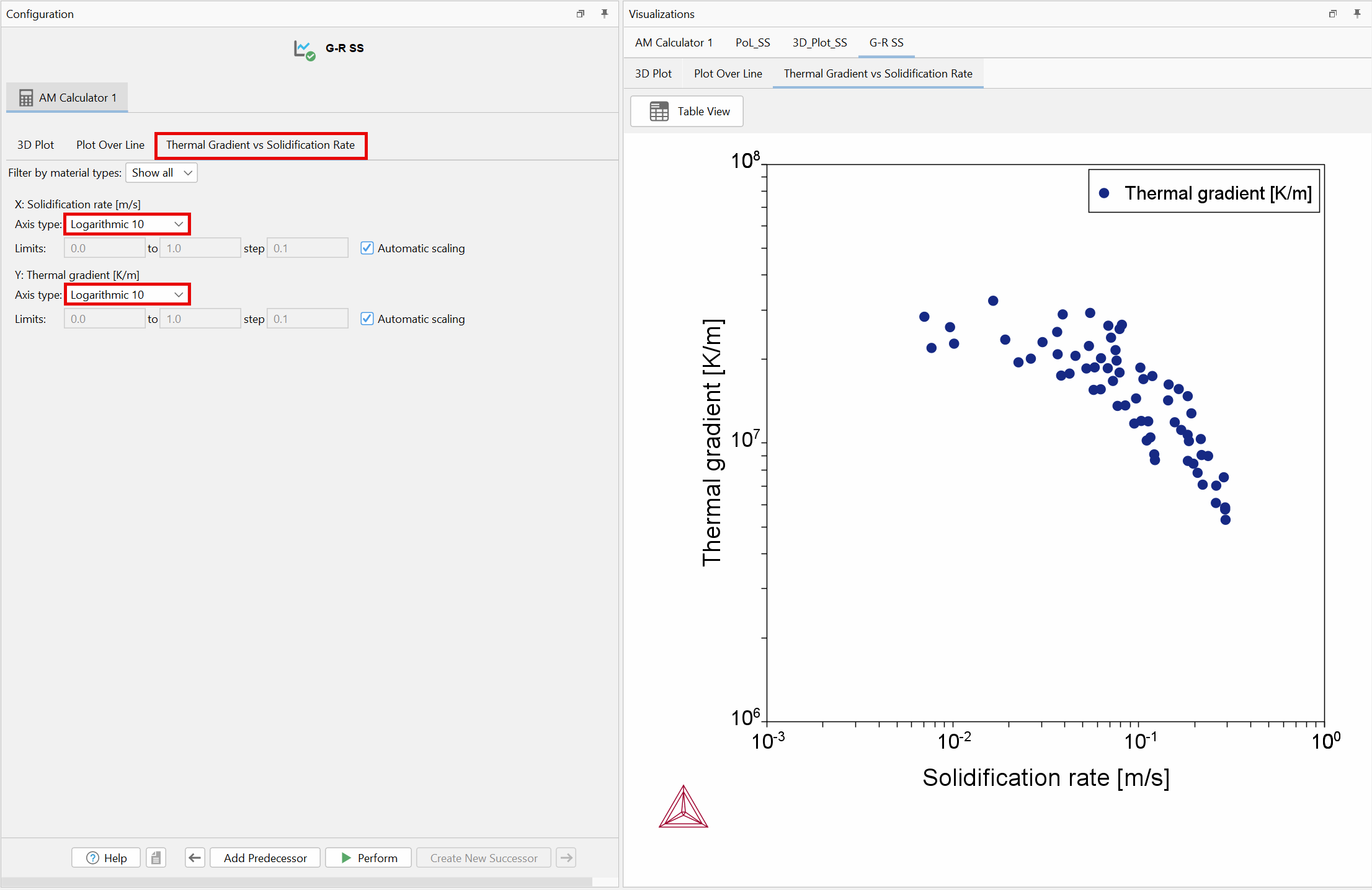
Thermal Gradient vs Solidification Rate
From Thermo-Calc 2025a onwards, a third tab named Thermal Gradient vs Solidification Rate is available. This plot shows the solidification rate (m/s) versus thermal gradient (K/m). By default, the plot is shown as Axis type: Linear. This can be modified by selecting Logarithmic 10 for both X-axis and Y-axis in the Axis type drop-down lists, as for a typical G-R plot from solidification literature. This plot is useful for analyzing important information such as whether the solidification front in the melt pool will become planar, cellular, or dendritic.
When we see that the Steady-state simulation runs okay, we are ready to move on to a single track simulation using the Transient with heat source from steady-state simulation mode.
Performing a single track process is a common experimental set-up to test process parameters before starting the build process.
We want to use the same system and data as for the steady-state simulation. Therefore, we can clone the AM Calculator we set up for the steady-state simulation. To do this, right-click on the AM Calculator 1 and click Clone Tree. This will clone the AM Calculator and the Plot Renderer.
For this example:
You can also use the Pick coordinates option to place the probes. Click ![]() and then, in the visualizations window, double-click on the position you want the probe to be placed.
and then, in the visualizations window, double-click on the position you want the probe to be placed.
When all settings are set, right-click on the AM Calculator 2 node and click Perform now to run the simulation.
Result of the Single Track Simulation
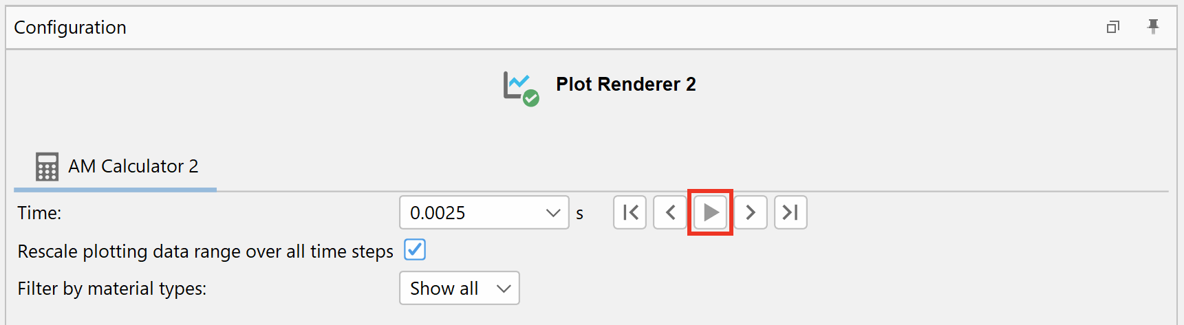
In Plot Renderer 2, keep the default setting and click Perform to populate the result in the Visualizations window. As with the steady-state simulation, the results can be shown as a 3D plot, a Plot Over Line, and Thermal Gradient vs Solidification Rate. The difference is that it is possible to see the evolution of temperature with time and how the laser beam moves in the 3D plot. To see this, click on the 3D Plot tab in the visualizations window, then click the play button at the top of the Configuration window.
You can also show a specific time step by selecting a time in the drop down list.
To see the Plot Over Line, go to the Plot Over Line tab and move the line to the position you want to investigate.
To see the Thermal Gradient vs Solidification Rate, click on that tab.
Plot at Probe Position
Since we added probes for this simulation, we can also plot the result at the positions of those probes. In the Configuration window, we have a fourth tab named Probe. The probe plot shows the temperature profile for all timesteps at the specific point that we selected in the AM Calculator. You can plot surface tension and thermal conductivity as well.
For this example:
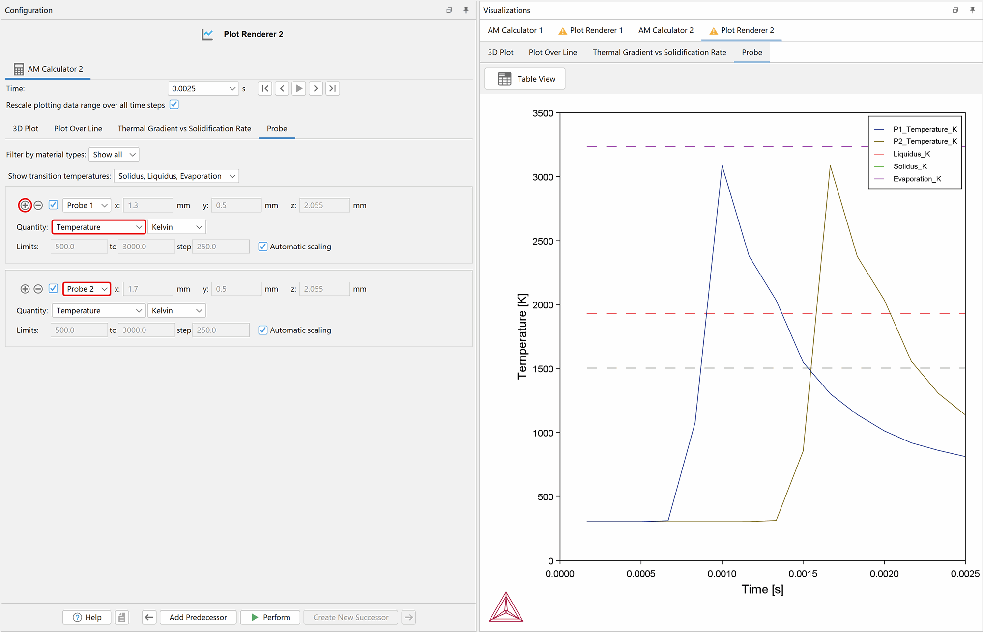
For this example:
When all settings are set, right-click on the AM Calculator 3 node and click Perform Now to run the simulation.
Note: This simulation takes around 15 minutes to complete depending on your system.
Result of the Multi-layer Simulation
In Plot Renderer 3, keep the default settings and click Perform to populate the result in the Visualizations window. The results are shown as a 3D plot, just as for the other calculations. However, here it is possible to see how the laser beam moves in different directions over the two layers. To view this, click on the play button at the top of the Configuration window.
The results can also be viewed as a Plot Over Line, Thermal Gradient vs Solidification Rate, and a Probe plot, as with the two previous simulations.