Tips and Tricks: How to Plot Experimental Data
The topics covered in this blog post:
- Open your Thermo-Calc software. If the program opens in Graphical Model, switch to Console Mode.
- The experimental files are generated in the postprocessor of the POLY module. In the SYS prompt, type go poly.
- In the POLY prompt, type save. In the Save window, navigate to the folder where you want to save your file, name your file and click Save.
Note: This step is not always necessary but is used to avoid errors when making an EXP file without any data. Do NOT use it to make an EXP file with calculated results in the poly module.
- Type post to go to the postprocessor.
- Define the axes variables* that you want in your plot. For example, type set-diagram-axis x THCD to set the x-axis to thermal conductivity and set-diagram-axis y T to set the y-axis to temperature.
- Then type plot to make the axis variables show in the Results window.
- To create the experimental data file (.EXP file), type make file in the POST prompt. In the Save window, navigate to the folder where you want to save your file, name your file and click Save.
*Variables that are dependent on components or phases not present in the workspace can not be used.
PROLOG
The PROLOG is where plot settings are configured. Here you can set the axis limits, axis type, tick length, plot title, and axis title. Change the values to fit the data you want to plot. The axis type can be set to either linear, logarithmic, or inverse. You can use the settings in the images in this article if you don’t have your own data.
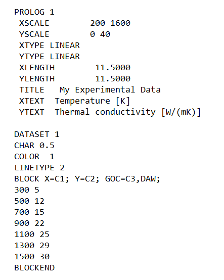
An example of how a PROLOG and DATASET can be written.
Plot the .EXP File in Thermo-Calc
The .EXP files can be read and plotted in both Graphical Mode and Console Mode.
Graphical Mode
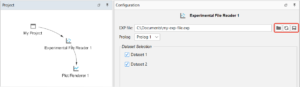
In Graphical Mode, the experimental file is opened in an Experimental File Reader.
- Right-click on My Project node, hover over Create New Activity and click Experimental File Reader.
- In the Configuration window, click on the map-button, navigate to your EXP file, and click Open.
- Your dataset(s) is now shown below the file path. If you have several datasets, you can select which ones you want to plot.
- Right-click in the Experimental File Reader node, hover over Create New Successor, and click Plot Renderer. Click Perform Now and your plot will show in the Results window.
If you make a change to the EXP file after you have read it, you need to re-read the file by using the refresh button and then click perform from the Plot Renderer node.
You can connect the experimental File Reader to any existing plot from a calculation. Right-click on the Plot Renderer node for your calculation, hover over Add predecessor, and click Experimental File Reader. Perform the activity again and the experimental data will show in the plot.
Console Mode
In Console Mode, the experimental file is read in the post processor of POLY Module.
- Go to the POLY-3 Module: At the SYS prompt type go poly.
- Go to the POST module: At the POLY prompt type post.
- At the POST prompt, type quick or append.*
- Select your file and click OK.
- Enter the Prolog and Dataset numbers you want plotted from your file (if applicable). If you want to plot more than one dataset, separate the dataset numbers with a space.
- At the POST prompt, type plot.
* Use quick if you are only plotting the .EXP file. Use append if you are plotting experimental data over an existing plot from a calculation.

To see the image larger, right-click and open in a new tab.
Plot With Symbols and/or Lines
For each data BLOCK you can set the Graphical Operations Code (GOC) to customize how the data in a specific BLOCK will be plotted. You can use different symbols to mark the data points, draw a line between the data points, and change which symbols and type of line you want to use.
Here is a list of the available GOCs:
W: World coordinates (* DEFAULT)
V: Virtual coordinates
N: Normalized plot box coordinates (NPC)
M: Move to this XY (*)
D: Draw to this XY
A: XY is absolute values (*)
R: XY are relative values
S: Plot current symbol at XY (add a number to indicate which symbol to use)
B: Apply soft spines on the drawn curve
‘: Plot the following text at XY
Plot the Data with Only Symbols
You can plot your data in different ways. For example,
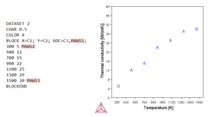
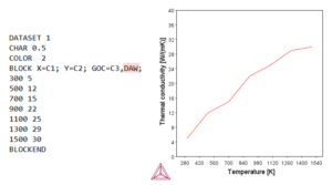
BLOCK X=C1; Y=C2; GOC=C3, MAWS1;
will plot symbol 1 at each datapoint if no other GOC is entered in column 3 in this BLOCK. The column number (GOC=C3) is the location of any possible GOC codes in the current data BLOCK, while MAWS1 is the default GOC for this data BLOCK. This means that you can change the GOC for a specific data point by simply writing the new GOC in column 3. For example, you can use different symbols for different data points.
All available symbols are shown in this image:

To see the image larger, right-click and open in a new tab.
Draw a Line Between Data Points
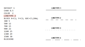
If you want to draw a line between your data points, you can change the GOC from MAWS1 to DAWS1. And if you don’t want to have any symbol for this data, you can remove S1 from the GOC.
You can use different linetypes to differentiate between the different data. For example, you could use a solid line for one dataset and a dashed line for another dataset. The default linetype is a solid line (linetype 1). The linetype is entered above the BLOCK line.
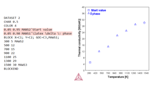
Add Legend
To describe what the different symbols and lines are showing, you can add a legend to your plot. To add a legend to your plot, you need to specify what you want the legend to say, how you want it to look, and where in the plot you want the text to go. The following information is entered within a DATASET above the BLOCK line:
- Enter the coordinates of where you want the legend to show. This is entered with coordinates between 0 and 1. For example, the coordinates 0.05 0.95 will place the legend in the upper left corner.
- On the same line, enter the GOC you want to use. Here you should use N instead of W to use normalized plot box coordinates.
- Directly after the GOC, add ‘ and write the text you want to show.
You can also use Latex commands if you, for example, want to use a greek letter to describe a phase.